

Estimate heritability
17th March 2025
I am known the the institute where I work as “that guy who always asks about heritability”, to which I respond that I always ask about heritability because it’s always a good idea.
Heritability describes how much of the overall variation in a trait you’ve measured is due to genetic differences between individuals. It’s a very useful piece of information because it gives you an idea of whether there is genetic variation for that trait in the sample you’re looking at. It is also fairly straightforward to calculate without any sequence data (we’ve been doing it for more than a century after all), as long as you plan the experiment carefully to limit confounding between genetics and environmental factors. These things means that estimating the heritability of a trait is a very good place to start if you want to know more about the genetics of a trait.
This post will illustrate how to estimate heritability of a normally-distributed phenotype from a randomised experiment with replication of genotypes of the kind you might set up with a plant like Arabidopsis thaliana. I’m focussing on inbred lines that are homozygous across the genome, so technically speaking this will be an estimate of what’s called broad-sense heritability. Broad-sense heritability does distinguish between additive and non-additive genetic effects such as domincance and epistasis, which makes sense here because the latter aren’t really meaningful in a population of inbred lines.
Set up the analysis
In a previous post I simulated an experiment as follows based on a real experiment I am working on:
- 622 inbred lines
- In three cohorts (two cohorts of F9s and one of their parents)
- Three replicates per line
- Pots placed in 39 trays, with 48 pots per tray.
- I randomised the position of the 622 lines within replicates
I will just run that code again to generate some data.
source("simulate-a-phenotype.R")

exp_design %>%
  select(cohort, line, replicate, tray, normal_phenotype)
 # A tibble: 1,872 × 5
    cohort  line      replicate  tray normal_phenotype
    <chr>   <chr>         <int> <int>            <dbl>
  1 cohort1 cohort1_…         1     1           -1.32
  2 cohort1 cohort1_…         1     1           -1.28
  3 cohort1 cohort1_…         1     1           -0.395
  4 cohort3 cohort3_…         1     1           -0.943
  5 cohort3 cohort3_…         1     1           -1.30
  6 cohort3 cohort3_…         1     1            0.450
  7 cohort3 cohort3_…         1     1           -0.931
  8 cohort1 cohort1_…         1     1            0.986
  9 cohort3 cohort3_…         1     1            0.238
 10 cohort1 cohort1_…         1     1           -1.55
 # ℹ 1,862 more rows
The obvious tool to fit variance-component models in R is the lme4 package. Install if necessary and load as follows:
    install.packages('lme4')
    library('lme4')
Visualising the variances
Before fitting any models, let’s plot some data to get an idea of what we’re trying to model.
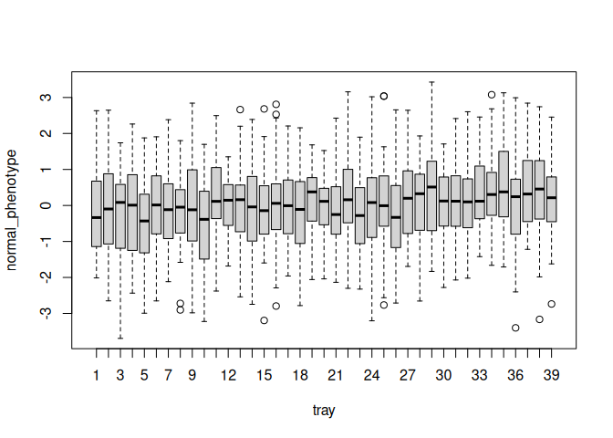
Here is a boxplot of phenotypes for plants in each tray. Each tray has a mean, and those means vary between trays. Within each tray individual plants vary, and this within-tray variation is much greater than between-tray variation.
    boxplot(
      normal_phenotype ~ tray, data = exp_design
    )
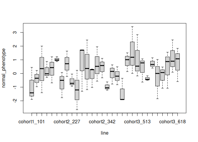
Here is a similar boxplot for phenotypes split by line. I’ve only plotted a random sample of 30 lines to keep it simple. You can again see that each line has a mean, and variance around that mean. However, there’s a lot more spread between line means than between tray means (compare the spread of the means along the y-axis with previous plot).
    boxplot(
      normal_phenotype ~ line,
      data = exp_design,
      subset = exp_design$line %in% sample(unique(exp_design$line), 30)
    )
Fit variance components
To estimate variance explained by different aspects of the experimental design we fit a ‘random-intercepts’ model. That means that for every group (i.e. every tray, every line, etc) we estimate a mean, and quantify the variance between those means. This is like calculating the variance between the means in the boxplots above, but in a way that accounts for the other aspects of the experiment at once.
This code estimates the variance in normal_phenotype explained by
replicate, tray and line.
    m1 <- lmer(
      normal_phenotype ~ (1 | replicate) + (1 | tray) + (1 | line),
      data = exp_design
    )
The output gives us variance and standard deviations between group means for line, tray and replicate, as well as an estimate of the residual variance not explained by those things. We also get a summary of sample sizes - this is very useful to check that the model has grouped things as you expect it should have, which is frequently not the case.
summary(m1)
     Linear mixed model fit by REML ['lmerMod']
     Formula:
     normal_phenotype ~ (1 | replicate) + (1 | tray) + (1 | line)
        Data: exp_design

     REML criterion at convergence: 5714.4

     Scaled residuals:
          Min       1Q   Median       3Q      Max
     -3.02038 -0.62565  0.00499  0.62138  2.68602

     Random effects:
      Groups    Name        Variance Std.Dev.
      line      (Intercept) 0.220817 0.46991
      tray      (Intercept) 0.004996 0.07068
      replicate (Intercept) 0.030970 0.17598
      Residual              1.042678 1.02112
     Number of obs: 1872, groups:
     line, 624; tray, 39; replicate, 3

     Fixed effects:
                 Estimate Std. Error t value
     (Intercept)  0.01751    0.10659   0.164
We really want to know what proportion of variance is explained by
each component. To do this, we extract the variance components with
VarCorr, add them up, and divide by the sum.
    variance_components <- as.data.frame(VarCorr(m1))
    variance_components$pve <- variance_components$sdcor / sum(variance_components$sdcor)
    variance_components
             grp        var1 var2        vcov     sdcor        pve
     1      line (Intercept) <NA> 0.220816828 0.4699115 0.27042262
     2      tray (Intercept) <NA> 0.004996143 0.0706834 0.04067658
     3 replicate (Intercept) <NA> 0.030969697 0.1759821 0.10127341
     4  Residual        <NA> <NA> 1.042677982 1.0211160 0.58762740
The column pve shows that differences between lines, accounting for
differences between replicates and tray, explains 27% of the variance in
the phenotype.
Why do we need a model?
Since this is a simulated experiment we know what the actual variances due to line, tray and replicate should have been:
    var(genetic_effects$genetic_effect)
    var(tray_effects$tray_effect)
    var(replicate_effects$replicate_effect)
    [1] 0.2471089
    [1] 0.006991593
    [1] 0.0312357
If you look in the table above you’ll see our estimates of these variances are pretty close to the real values.
We started by looking at means on a boxplot. What if we had just estimated the variances between those means without a model? Taking the example of line means, we can see that this would overestimate the true mean by more than two-fold.
    exp_design %>%
      group_by(line) %>%
      summarise(
        mean = mean(normal_phenotype)
      ) %>%
      pull(mean) %>%
      var()
[1] 0.5704147
There are two reasons for this:
- When you fit a random-intercepts model, the group means are estimated as coming from a normal distribution with a finite variance. In practice that means that more extreme means tend to be pulled towards the mean.
- Second, using raw means doesn’t account for variances between trays and between replicates, so these factors end up inflating the apparent variance between lines. This is why it is a really good idea to take the time to think through experimental design to identify and eliminate confounding factors as much as possible before starting an experiment.